Previously named Super U the superfood brand had its limitations. Our aim was to create a new brand identity and refreshed packaging designs to support the brand’s fast growth and expansion across the globe.


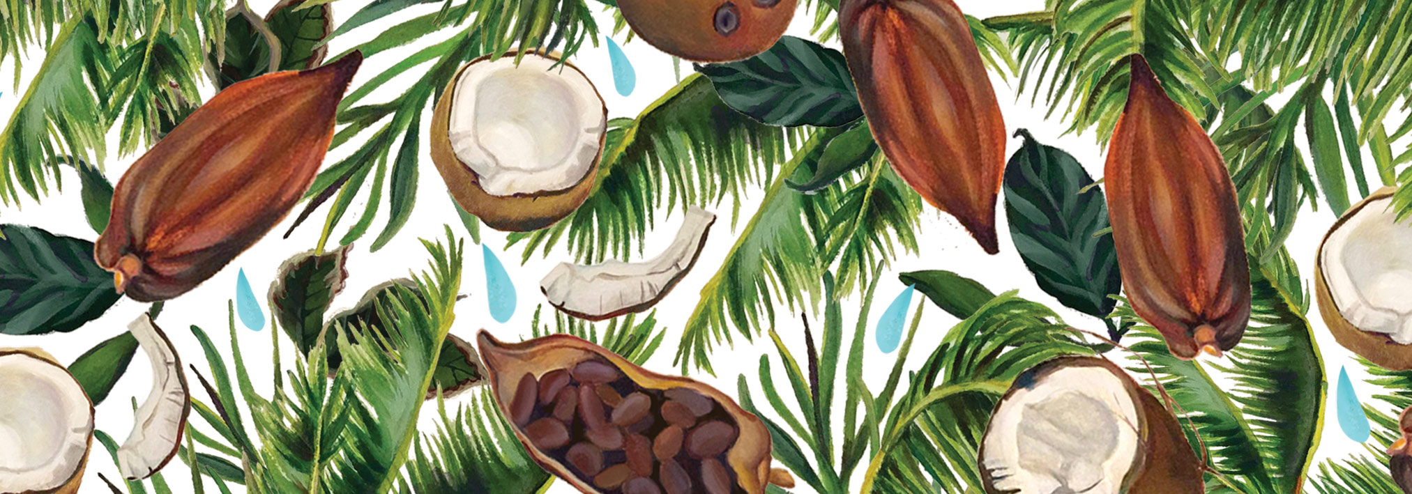
We curated a warm and uplifting colour palette to complement the hand-painted illustrations. Combined with a matte and textured finish on the packaging it creates an overall natural and optimistic feel.


We worked with the Super U team to create a brand that could harness the real impact of superfoods. The end result was a merge of the words Real & Heal to form Rheal. The new wordmark channels the 100% organic plant-based ingredients used in the products. A positive and gentle approach for a brand focussed on all things natural and full of goodness.