When creating a brand identity, deciding on brand colours that really represent your business can be one of the most fun – yet also pretty daunting – parts of the process.
How do you ensure you choose the perfect brand identity palette that looks great, sets you apart from competitors and is accessible for all? We’ve put together this 5 step guide to help.
1. Choosing brand colours for personality
Colour plays such an important role in how your brand’s personality comes across. Before even looking at colours, we like to establish just what a brand is trying to achieve. Find some keywords that communicate exactly where you want to be. Are you quirky or conservative? A disruptor or safe?
Colours, generally, are considered to have their own meanings. We’d take these with a pinch of salt, but knowing the connotations of each colour gives you a decent foundation for understanding each when considering how your brand should feel.
2. Do your research
It sounds obvious, but the best way to find inspiration is by discovering what is already out there. After all, how can you stand out from the competition without first looking to see what the competition looks like?
At BE.OM, we always start by looking at the world as it is today. Find out who your competitors are. How do they look? Do the colours and branding they use match their message? Does it feel right?
Competitor mapping can give you an immediate feel for how the market looks. There’s an opportunity to immediately stand out by simply applying a contrasting colour to the other brands around us. Of course, this alone isn’t the answer, but it gives us a good starting point.
It’s not just about competition though, and researching other brands that use beautiful brand colours can certainly inspire your own. We’ve picked a selection below to show how colour can really define a brand’s personality:
Monzo has a distinctive look which really differentiates it from other banks:

Jewellery brand Tiffany is so recognised by it’s ‘Tiffany Blue’ colour that it is recognisable even without the logo:

And in branding, it certainly doesn’t get anymore distinctive than this:

3.Finding your brand colours
If you don’t feel confident in your ability to match colours, there are a number of great resources online to help get that perfect palette. There are a few ways to approach matching colours together:
Monochromatic: Different shades and depths of a single hue
Complementary: Complementary or opposite colors from the color wheel (like red and green, blue and orange, etc.). Complementary palettes are great for communicating a sense of balance.
Analogous: A primary color and the colors from either side of it on the color wheel. These palettes do a great job of expressing consistency within design.
At BE.OM, we recommend a number of tools to help kickstart your search for the perfect palette.

Google Material Palette Generator

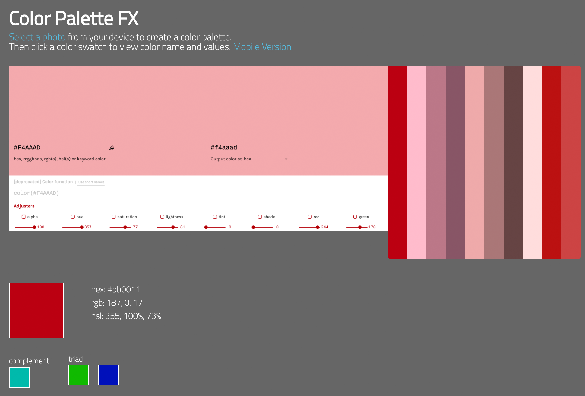

Toolness Accessible Color Matrix
4. Accessibility
Globally, it is estimated that approximately 1.3 billion people live with some form of vision impairment, 217 million with moderate to severe impairment (The World Health Organisation).
Making your brand colours accessible to everyone is obviously greatly important, and enables people with visual impairments or colour vision deficiencies to have the same great experience as other users.
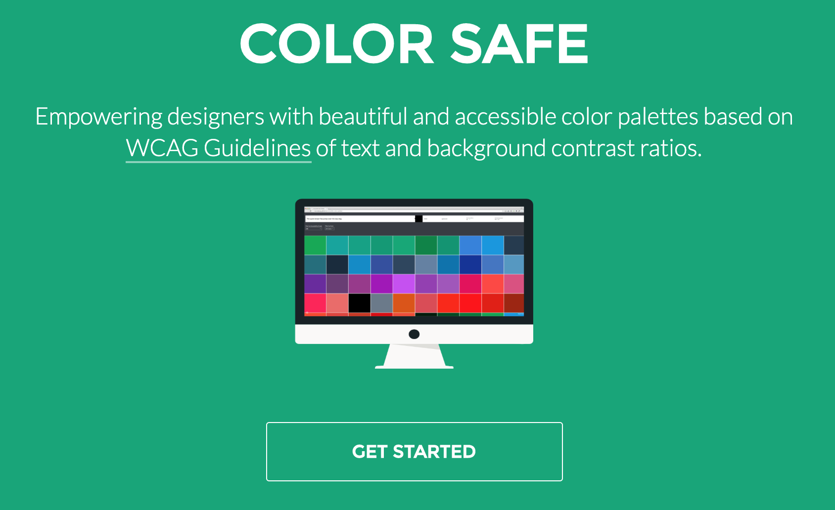
There are some great tools to help you create and test your accessible colour palette. We’ve selected some of the best below:
Coblis Colour Blindness Simulator
Tip: Don’t rely solely on colour
A great way to enhance your site’s accessibility is by not relying purely on colour to distinguish key site features and interactive states. For example, error states, success states, or system warnings it’s a good idea to incorporate messaging or iconography that clearly signposts what is happening.

Source: Google Material
Another good tip is the use of texture, which is especially useful when designing charts and infographics.
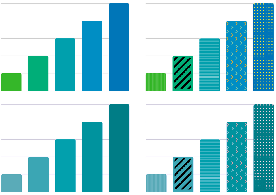
Source: Secret Stache/
5. Test your colours
Once you have decided on your colour palette, we want to make sure it’s working, right? Testing and prototyping the colour palette in real-life scenarios is an essential step in making sure you hit the mark.
Tools such as Sketch and Adobe XD are a great way of applying your palette to banner designs, logos, and website layouts, allowing you to compare variations in how you apply your colour scheme.


For testing to make sure your call to action buttons stand out, your text is legible and other colour related factors, we’re big fans of Usability Hub’s Five Second testing.
It’s a great way to get user feedback really quickly!
Usability Hub – Five Second Tests
Still need to know more?
Get in touch with us if you have a branding project or need to find out more about making your brand stand out!